Which form of SST to use, when, and why.
When it comes to running dozens of miles offshore, we all wish we knew exactly where the fish were when we put in the waypoint and pulled away from the dock. Fortunately, while none of us can ever be certain we’ve chosen the right destination until the rods go down, our decisions can be far more informed in this day and age than they once were. Checking out the SST info at SatFish is, without a doubt, a key component to turning a guess into an informed decision.
That said, when it comes to any SST resource there’s a world of difference between bringing up the service and comprehending exactly what it’s telling you. Setting aside chlorophyl, bathymetrics, and the other things you might be looking at, on SatFish you have multiple forms of SST alone: raw, high-definition, cloud free, and three-day composites. So, which should you be checking out, and when?
Raw Sea Surface Temperature
Raw SST will be a critical part of intel-gathering for some experienced users in some areas. It provides direct unadulterated data, including data that might be filtered out looking at the other SST maps. However, it can be deceiving. That big temperature difference you’re looking at on the screen may have been caused by cloud cover or fog, as opposed to being the actual temperature of the water. That’s why the other SST maps on SatFish filter the data through algorithms and block out questionable areas. And that’s also why the raw data isn’t available everywhere; in areas where the cloud filters can predictably and reliably do its work it isn’t necessary.
Raw charts should always be taken with a grain of salt, and you need to remember that nature can sometimes fool even the best of us. It won’t be the first SST chart most of us look at, but it can provide some extra insight to experienced users. Just remember, it can be a bit misleading at times if you aren’t cautious about how you look at it.
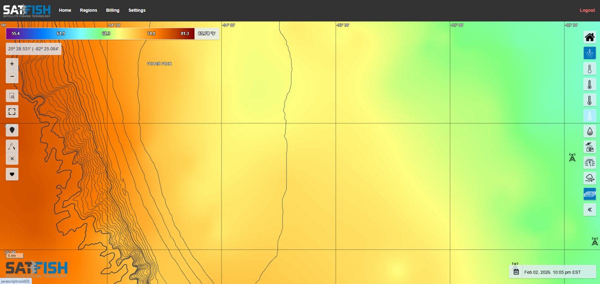
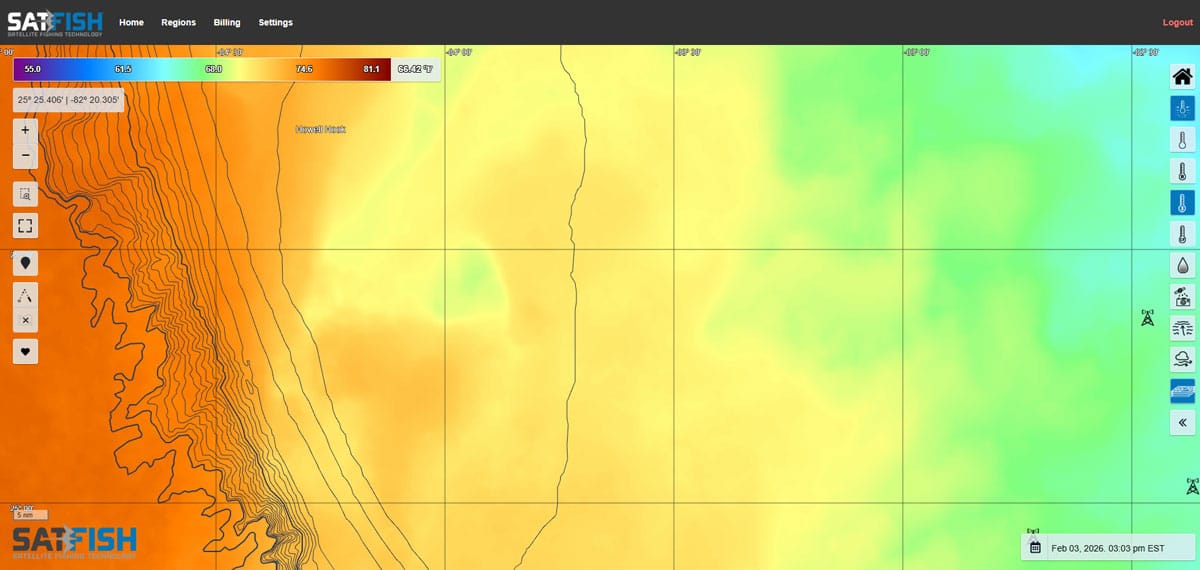
High-Def Sea Surface Temperature
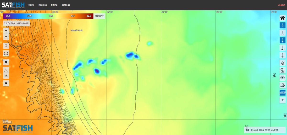
For the vast majority of the offshore anglers out there the high def sea surface temp charts will be the first stop in the data-gathering voyage. These are the easiest to read at a glance, and visually spotting breaks and eddies is a piece of cake. If you can pull up the current shots and spot the hotspots, great. But there’s a fly in the ointment: clouds. Cloud cover can block out the satellite’s view of the ocean, making it impossible for them to sense the infrared heat signatures of the water’s surface. Looking at raw data you’d only see a big temperature difference (this is where some people can get led astray), but on SatFish’s SST charts they’re filtered out and replaced with a blank area so you know the data in that spot isn’t reliable.
It’s always good to start off by looking at the high-def SST charts, but realize that the specific area you’re interested in may be blocked or partially blocked depending on the weather at any given time. Which brings us to…
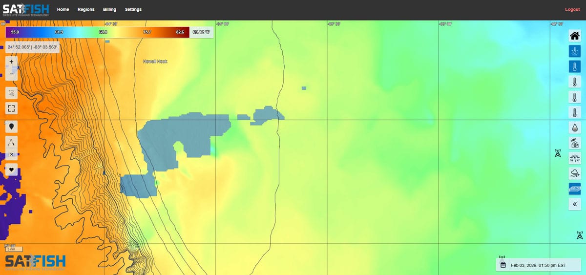
Cloud-Free SST Charts
The good thing about clouds is that they move. Constantly. And one way of working around the gaps created by cloud cover is to blend the available areas of hi-res satellite data with lower resolution microwave SST data to develop cloud free SST charts. The view this provides isn’t quite as well-defined and bodies of water appear more blended at the edges rather than showing the sharp, abrupt changes. In real-world use that means you might not be able to choose a waypoint that’s right in the middle of the bullseye, but you will be able to figure out where the bullseye is and hunt for its center once you’re in the right neighborhood. And you’ll be able to figure it out even more accurately if you also take a peek at three-day composites.
Three-day Composites SST
The three-day composite is part of SatFish’s high-def SST service, and it’s part of the menu you’ll want to familiarize yourself with for sure. These maps don’t deliver quite as much detail as the current hi-res charts, but they do provide a view that incorporates multiple days’ worth of data to compile an overall look at what the water temps are in a given area. When spotty in-and-out cloud cover is an issue it can provide the big-picture view.
What can be even more helpful at times is making your own “composite” of sorts. You can look at historic views of the SST going back in time for up to a week. This gives you a view of how the water’s been trending, which direction eddies are headed in, and where breaks might be shifting or forming. You can get a feel for how fast or slow changes are taking place, and make a pretty darn good educated guess as to what changes are likely to take place in the next 12 to 24 hours.
Added bonus: on SatFish you can animate the history, press the “play” button, and watch the waters shift and change over time at different speeds. And since SatFish snaps off eight to 12 shots a day, the animation can make it exceedingly clear just how the breaks and eddies are evolving.
Will a deep dive into each of these different form of SST data ensure that you point the bow directly at the fish each and every time you leave the dock? Aw, heck no. Will it guarantee bent rods and cockpit chaos day after day? Of course not. But it will make each and every guess you make one heck of a lot more educated — and in the long run, we’ll bet you end up catching a heck of a lot more fish.